
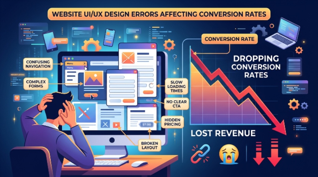
The most common UI and UX mistakes that reduce website conversions are confusing navigation, slow loading pages, weak calls to action, poor mobile usability, and complicated forms. Removing these friction points helps visitors complete desired actions faster while increasing trust, engagement, and conversion rates.
A website should guide visitors toward one clear action instead of creating confusion. Even attractive designs fail when users struggle to find information or complete simple tasks. Research shows that nearly 88% of users are unlikely to return after a poor website experience. Another widely reported benchmark indicates that more than half of mobile visitors leave pages that load slowly.
This guide explains the most common mistakes that reduce conversions and provides practical ways to fix each one.
Why UI And UX Matter For Website Conversions
User interface controls how visitors interact with visual elements. User experience shapes how people feel while completing important tasks.
When both work together, visitors understand your offer quickly. As a result, they stay longer and complete more conversions.
Good design removes uncertainty at every step. Therefore, users make decisions with greater confidence.
Confusing Navigation
Visitors should find important pages without guessing. Complex menus often create frustration before users explore your content.
Simple navigation improves confidence and reduces unnecessary clicks. Clear categories also help visitors move naturally through your website.
How To Fix Navigation Problems
- Limit main menu options.
- Use familiar page names.
- Keep important pages visible.
- Add clear search functionality.
- Maintain consistent navigation everywhere.
Weak Or Unclear Value Proposition
Visitors decide quickly whether your website solves their problem. Generic headlines rarely communicate meaningful value.
Instead, explain what you offer immediately. Then support your message with concise benefits and visual proof.
Better Messaging Tips
- Write clear headlines.
- Focus on customer benefits.
- Avoid technical jargon.
- Display important information above the fold.
- Support claims with proof.
Poor Call To Action Design
Visitors cannot convert without clear direction. Multiple competing buttons often create decision fatigue.
A strong call to action tells users exactly what happens next. Consequently, more visitors complete desired actions.
Improve Your Call To Action
- Use action focused text.
- Make buttons visually prominent.
- Place important buttons naturally.
- Repeat primary actions thoughtfully.
- Keep wording simple.
Slow Website Speed
Slow websites damage user trust immediately. Many visitors leave before content fully appears.
Fast loading creates better experiences across every device. Therefore, performance improvements often increase conversions without changing content.
Ways To Improve Speed
- Compress large images.
- Reduce unnecessary scripts.
- Enable browser caching.
- Optimize code efficiency.
- Remove unused plugins.
Poor Mobile Experience
Most visitors now browse using smartphones. A desktop focused design often creates unnecessary frustration.
Buttons should remain easy to tap comfortably. Likewise, text should stay readable without zooming.
Mobile Optimization Checklist
- Use responsive layouts.
- Increase button sizes.
- Simplify navigation menus.
- Reduce unnecessary popups.
- Test every important page.
Long And Complicated Forms
Every additional field creates more effort. Consequently, completion rates often decline as forms become longer.
Ask only for information needed immediately. Later, collect additional details when appropriate.
Form Improvement Tips
- Remove unnecessary fields.
- Use helpful placeholders.
- Show validation instantly.
- Group related information.
- Offer autofill support.
Cluttered Visual Layout
Too many visual elements compete for attention. Visitors struggle when everything appears equally important.
Whitespace improves readability and highlights essential content. As a result, users focus on important actions.
Create Cleaner Layouts
- Reduce visual distractions.
- Organize related content.
- Maintain consistent spacing.
- Limit color variations.
- Prioritize important sections.
Inconsistent Design Elements
Different button styles confuse visitors. Changing layouts between pages also reduces confidence.
Consistency creates familiarity throughout the website. Therefore, users navigate naturally without learning new patterns repeatedly.
Maintain Design Consistency
- Standardize buttons.
- Use matching typography.
- Keep colors consistent.
- Follow one spacing system.
- Reuse design components.
Missing Trust Signals
Visitors hesitate before sharing information or making purchases. Without trust signals, uncertainty increases significantly.
Display customer reviews, testimonials, certifications, and security indicators where decisions happen. These elements reduce hesitation naturally.
Build Visitor Confidence
- Show customer reviews.
- Display security badges.
- Highlight guarantees.
- Include business contact details.
- Present authentic case studies.
Poor Content Readability
Large text blocks discourage reading. Visitors scan pages before deciding whether content deserves attention.
Short paragraphs improve comprehension. Likewise, descriptive headings help users locate information faster.
Improve Readability
- Write shorter sentences.
- Use meaningful headings.
- Break content into sections.
- Highlight important information.
- Keep language straightforward.
Annoying Popups And Interruptions
Popups can support conversions when used carefully. However, excessive interruptions often create frustration.
Allow visitors time to explore first. Then present offers that match their interests.
Smarter Popup Strategy
- Delay popup appearance.
- Limit popup frequency.
- Offer real value.
- Provide easy closing options.
- Avoid covering important content.
Ignoring Accessibility
Accessible websites serve more users successfully. Better accessibility also improves overall usability for everyone.
Readable text, keyboard navigation, and descriptive labels create smoother experiences across different abilities.
Accessibility Best Practices
- Maintain color contrast.
- Add image descriptions.
- Support keyboard navigation.
- Label every form field.
- Use readable font sizes.
No Clear Conversion Path
Visitors should understand each next step naturally. Confusing journeys increase abandonment throughout the process.
Map every page toward one primary goal. Consequently, users experience fewer obstacles before converting.
Create A Better User Journey
- Identify visitor goals.
- Remove unnecessary steps.
- Simplify decision points.
- Guide users clearly.
- Measure completion rates regularly.
Not Testing Design Changes
Design decisions should rely on user behavior instead of assumptions. Continuous testing reveals hidden conversion problems.
Small improvements often create meaningful gains over time. Therefore, monitor user behavior after every important update.
Useful Testing Methods
- Run A B tests.
- Analyze heatmaps.
- Review session recordings.
- Monitor conversion funnels.
- Collect user feedback.
Common UI And UX Mistakes At A Glance
- Confusing navigation
- Weak value proposition
- Poor call to action design
- Slow loading pages
- Weak mobile usability
- Long forms
- Cluttered layouts
- Inconsistent design
- Missing trust signals
- Poor readability
- Excessive popups
- Limited accessibility
- Unclear conversion paths
- Lack of testing
Conclusion
High converting websites rarely depend on flashy designs alone. Instead, they remove friction and help visitors complete important actions quickly. Start by fixing navigation, page speed, forms, mobile usability, and trust elements first. Review user behavior regularly, test improvements consistently, and continue refining every step of the customer journey for stronger conversion results.
FAQs
What is the biggest UI or UX mistake that reduces conversions?
Confusing navigation and unclear calls to action usually reduce conversions the most.
Does website speed affect conversion rates?
Yes, faster websites improve user satisfaction and increase the likelihood of conversions.
Why are long forms bad for conversions?
Long forms create extra effort that encourages visitors to abandon the process.
Should every page have a call to action?
Yes, every important page should guide visitors toward one clear next action.
How often should website UX be tested?
Review user behavior regularly and test important design changes whenever updates are made.